Portfolio Sample
A regional bank does not have one branch, it has dozens, each with its own sales trends, seasonality, and growth story. This dashboard consolidates two years of branch and regional performance into one view, built to answer a leadership team's most basic recurring question: which regions and branches are actually driving growth, and which ones need a closer look?

Disclaimer: The data used in this project was AI-generated based on prompts I created, built to reflect realistic industry patterns rather than a dramatic or invented story, intended to showcase example dashboard design and analysis.
A regional bank with dozens of branches does not get a clear read on performance from any single number. Leadership needed a recurring view that could answer a few connected questions at once: is production tracking against target, is it growing year over year, and which specific regions or branches are driving that growth versus falling behind, without pulling together scattered spreadsheets every month to find out.
A synthetic dataset modeled to resemble realistic regional banking sales patterns across an eight-state footprint, roughly 48 branches and 360+ employees, covering two years of production data with real-world texture built in: seasonality, branch lifecycle events like new openings, and a mid-period incentive program redesign, rather than a flat, artificial trend line.

I built the data model around two related but distinct questions: how is the whole bank performing right now, and where specifically should leadership look closer.
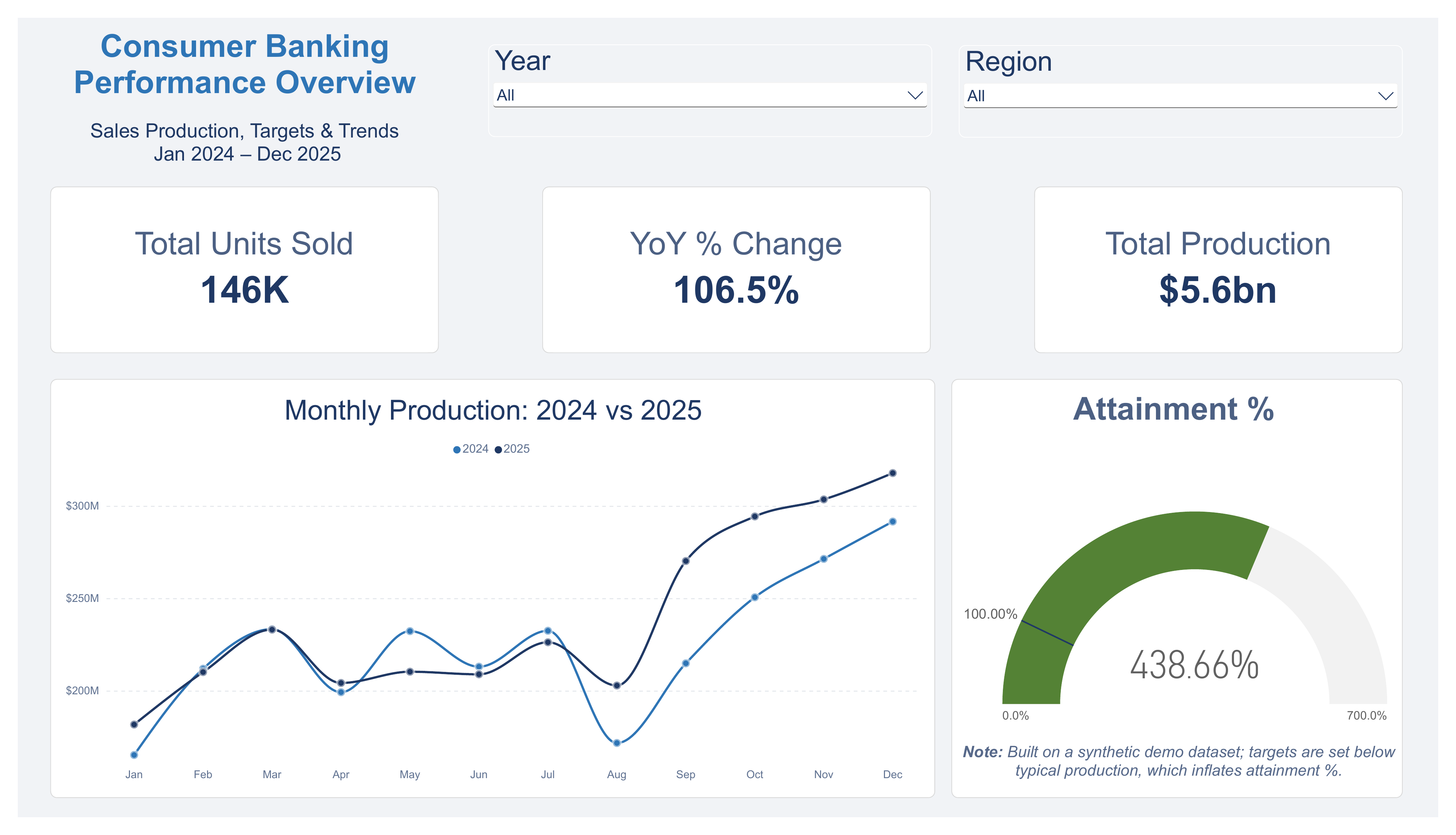
Page 1 provides a fast pulse check, production, growth, and attainment against target.
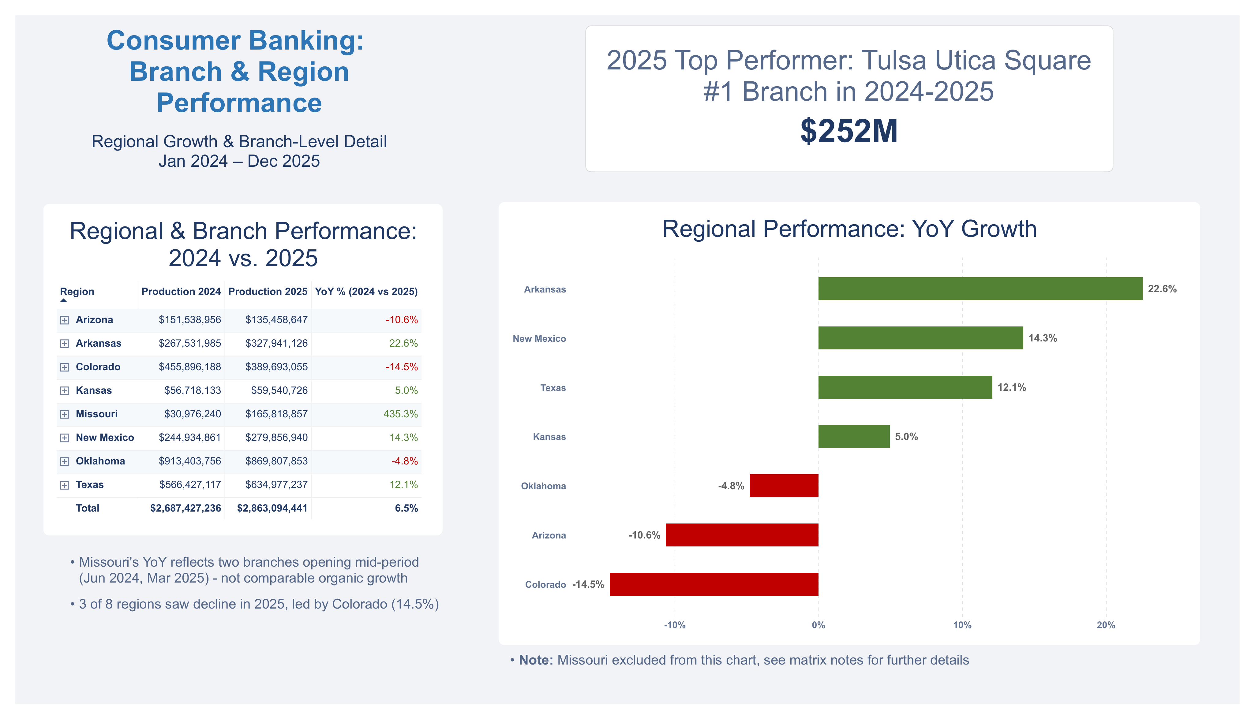
Page 2 drills into the region and branch level, with year-over-year comparisons and callouts flagging results that need context, like a branch opening mid-period skewing its growth number.
The goal was a dashboard that doesn't just report numbers, but tells leadership which ones deserve a second look.
Page 1 provides the fast pulse check, production, growth, and attainment against target across the full two-year period. Page 2 drills into where that performance is actually coming from, comparing every region and branch year over year. Click either screenshot to expand.
Design Note: This dashboard was kept intentionally simple, the focus was the data model and analysis, not the visual design. A production dashboard for an actual business would be tailored and polished well beyond this sample work.
Everything behind this dashboard is available to download: the Power BI file, a PDF version, and the full dataset.
Total production grew 6.5% year over year, from $2.69B in 2024 to $2.86B in 2025, solid, broad-based growth across the branch network.
Attainment against target came in high, but that reflects conservative target-setting in this dataset more than exceptional performance, a good reminder that attainment % alone doesn't tell the full story without checking how the target was set.
Missouri showed the largest year-over-year growth, but it's a base effect, not organic performance, two branches opened mid-period, which mechanically inflates the growth percentage.
3 of 8 regions declined in 2025, led by Colorado at -14.5%, a reminder that a healthy portfolio total can still be masking real underperformance underneath it."
Tulsa's Utica Square branch was the #1 performer in both 2024 and 2025, generating $252M, the most consistent bright spot in the entire dataset